Home / A. Equitable Growth Framework Manual / Populations Vulnerable to Displacement Overlay
Manuals and Metrics
Table of contents
Populations Vulnerable to Displacement Overlay
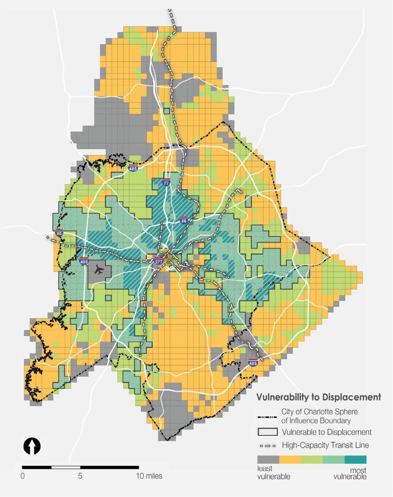
As a critical layer of analysis, an overlay identifying concentrations of residents that are vulnerable to being impacted negatively by change was developed. The analysis identifies residents that have characteristics that tend to make them more vulnerable to potential displacement. Unfortunately, the same characteristics that make certain populations susceptible to displacement are used in identifying whether environmental impacts are justly distributed. Areas with higher concentrations of vulnerable populations are overlaid on the access to opportunity and environmental justice maps to better understand how physical conditions, access, costs and benefits impact residents that have suffered from systemic racial and other social discrimination and/or are less likely to be able to adapt to economic and other changes. The measures contributing to vulnerability to displacement are often good indicators, along with low or no car ownership, of transit propensity as well. Transit propensity is a concept that measures the likelihood of using public transit.
Four measures have been documented as major contributors to vulnerability to displacement and are used to identify the areas with the most vulnerable populations across Charlotte:
- Poverty Rate;
- Educational Attainment;
- Race; and
- Age.
Areas that meet these four conditions will be identified as areas vulnerable to displacement.
Poverty Rate
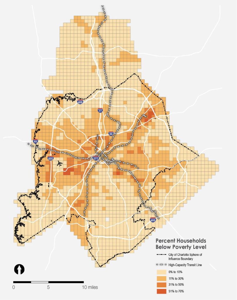
Areas with a greater percentage of residents living at or below the poverty level (relative to the County’s average rate) are considered to be vulnerable. The map to the right shows the household poverty rate by grid cell (based on 2018 ACS 5-year estimates by block group, apportioned to grid cells).
Map below: Household Poverty Rate, 2018
Poverty Rate, Compared to County
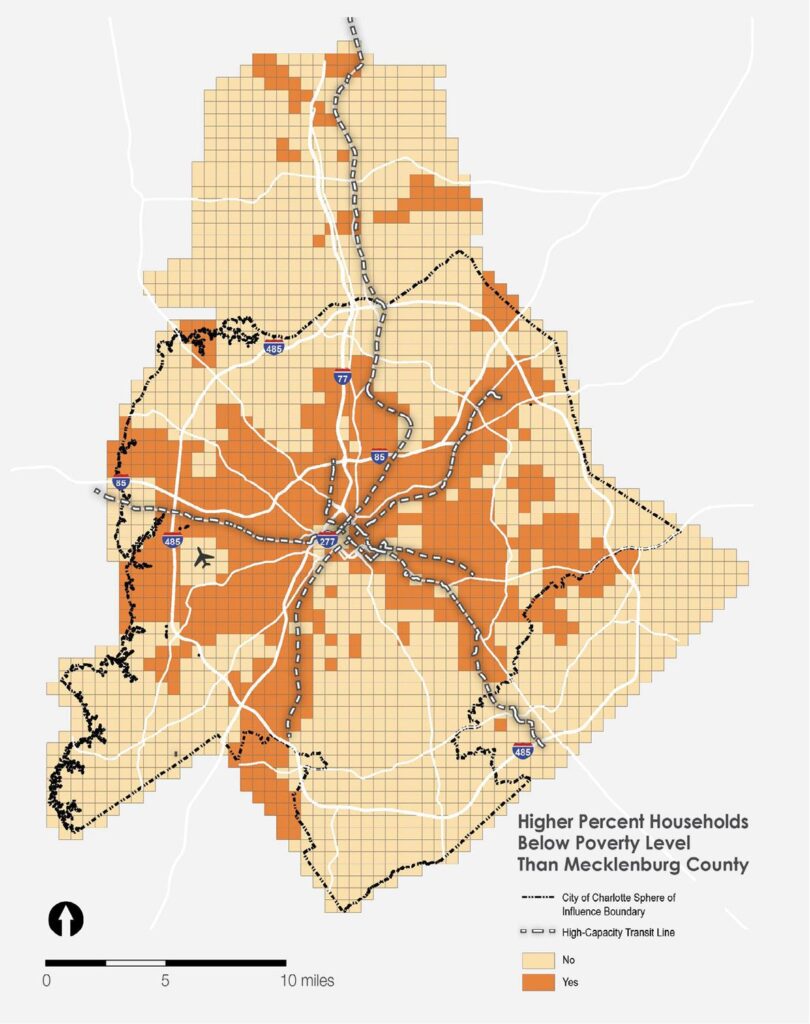
Any area with a poverty rate higher than the county-wide rate of 11.2% were considered to be vulnerable.
Map below: Areas with Household Poverty Rate Exceeding Mecklenburg County, 2018
Education Attainment Rate
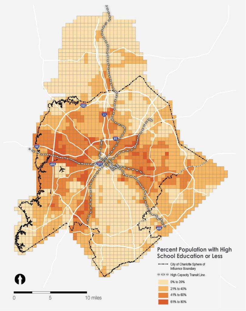
Areas with a greater percentage of residents that have low educational attainment rates (High School degree/GED or less) are considered to be vulnerable. The map at right shows the rate of low education (among the population age 25 and older) by grid cell (based on 2018 ACS 5-year estimates by block group, apportioned to grid cells).
Map below: Education of Population Age 25 and Older, 2018
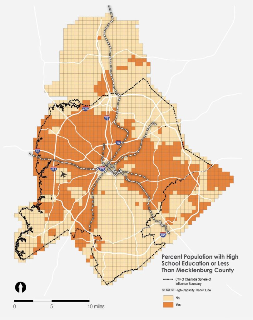
Education Attainment Rate, Compared to County
Any area with a rate higher than the count-ywide rate of 27.3% were considered to be vulnerable, as shown in the map at left.
Map below: Education Compared to County
Race
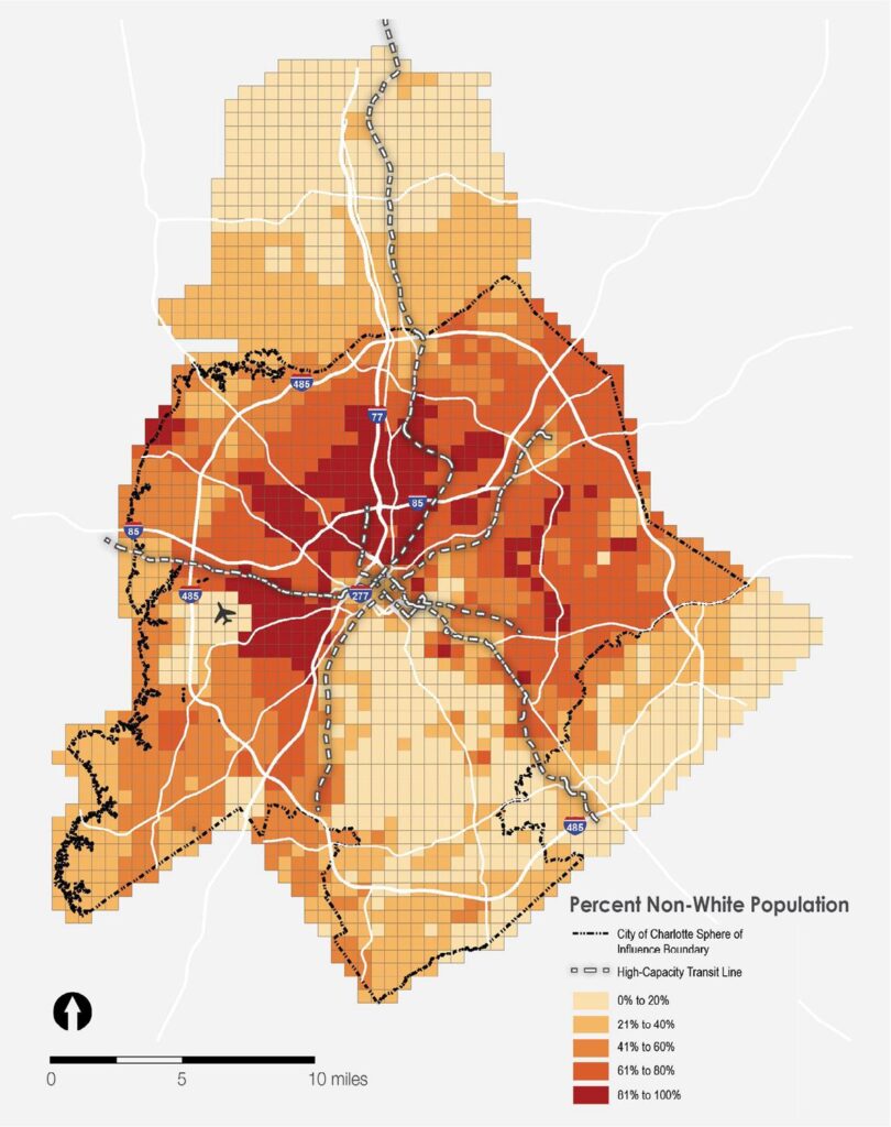
Areas with a greater concentration of non-white residents are identified as potentially vulnerable. These areas may not truly reflect vulnerability of residents themselves, but likely indicate areas disadvantaged due to historical racially based structural and systematic policies (e.g. redlining) which may still be resulting in lingering issues that cause the areas to lack access to opportunity. The map at right shows the non-white population by grid cell (based on 2018 ACS 5-year estimates by block group, apportioned to grid cells).
Map below: Percent Non-White Population, 2018
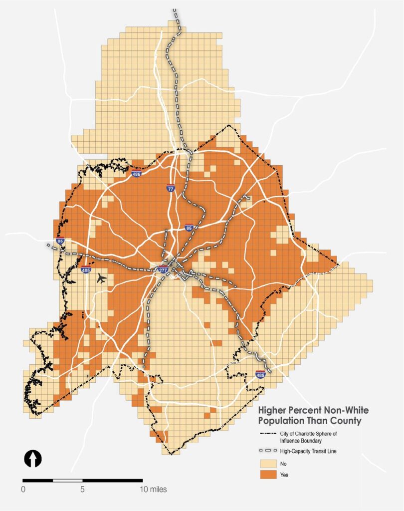
Race, Compared to County
Any area with a rate higher than the county-wide rate of 45.5% were considered to be vulnerable, as shown in the map at left.
Map below: Non-White Population Compared to County
Age
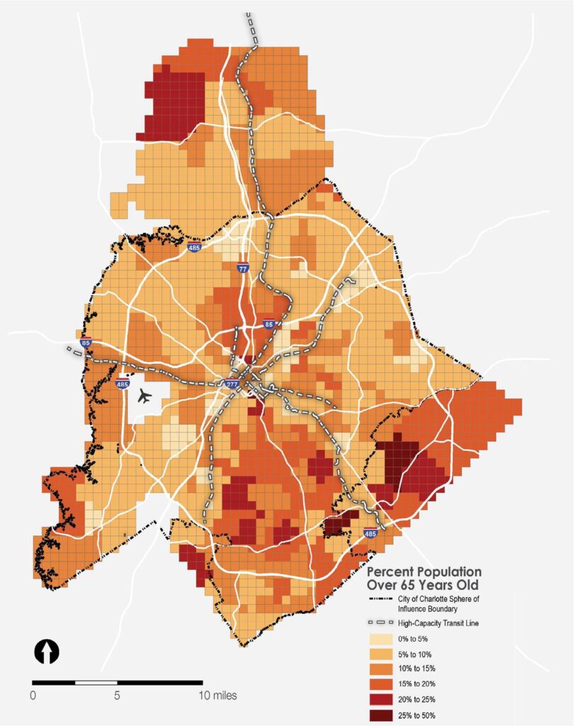
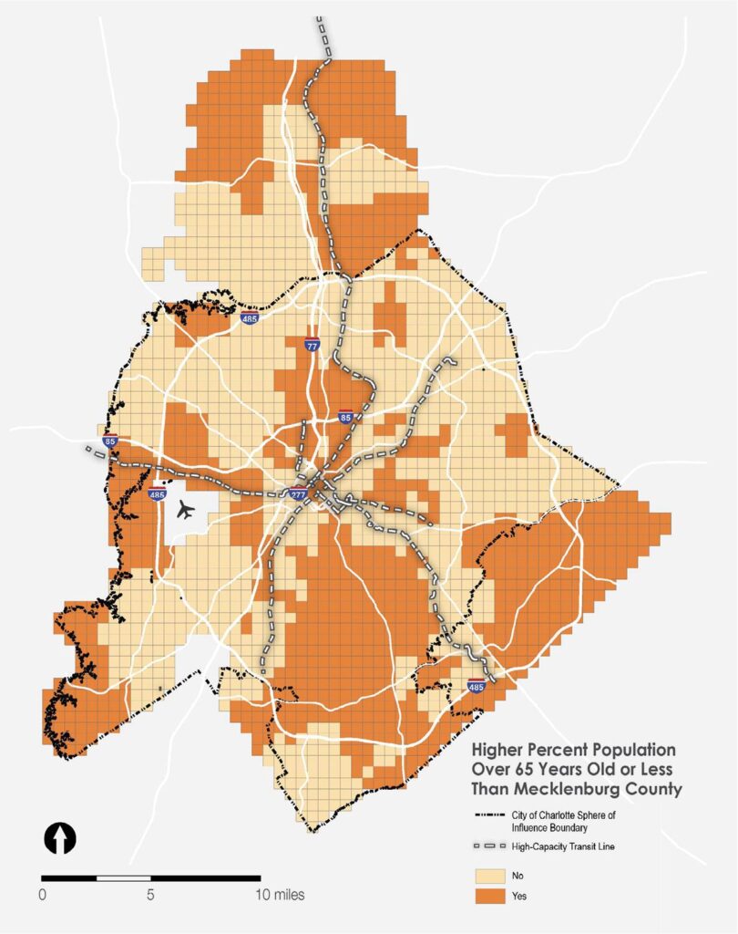
Areas with a greater concentration of residents aged 65 or older are identified as potentially vulnerable. The map at right shows the age 65+ population by grid cell (based on 2018 ACS 5-year estimates by census tract, apportioned to grid cells).
Map below: Percent Population Age 65+, 2018
Age, Compared to County
Any area with a rate higher than the county-wide rate of 10.6% were considered to be vulnerable, as shown in the map at left.
Map below: Age 65+ Population Compared to County
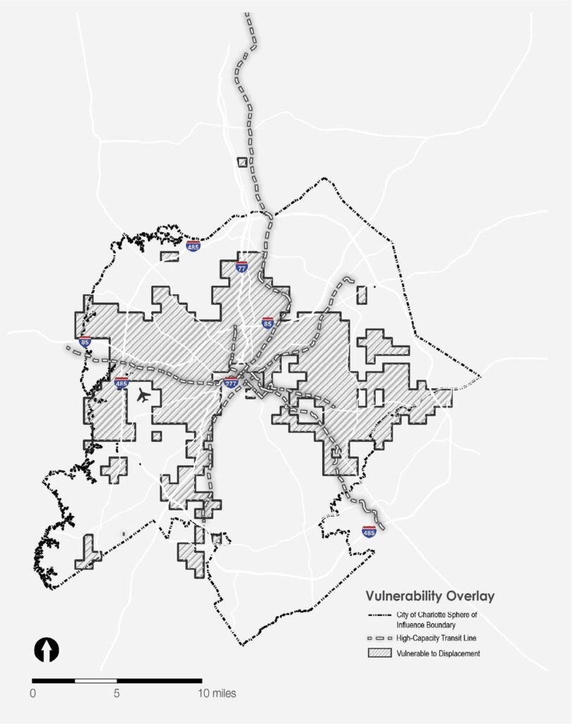
Vulnerability Overlay
Using the described metrics and taking the most vulnerable grid cells from the Vulnerability to Displacement map, the overlay shown in the map at right was applied to all the Equitable Growth Framework Maps.
Map below: Areas Vulnerable to Displacement Overlay
Future Vulnerability to Displacement Metrics to Consider
The following data sets were not included in the measurement of Vulnerability to Displacement for various reasons including lack of available data, poor data quality, or out of date information. If these data sets become more usable and accurate in the future, they should be considered for use in the Vulnerability to Displacement Equity Metric.
- Ethnicity
- Disability
- Owner-Occupied Single-Family Housing
- Land Values
- Average Single-Family Home Size
- Adjacency to Current/Proposed Mass Transit Corridor
